Simplicity out of Complexity: Data Visualization
The APDU Annual Conference kicked off with a breakout session focusing on visualizing and communicating data to the public. Considering that data is the new oil, given organizations’ high willingness to pay and need for data on themselves and consumers, it is important to keep the audience in mind when presenting data. As many time-constrained executives and policy makers read data reports to make informed decisions, it is essential to present the information in an easily digestible manner.
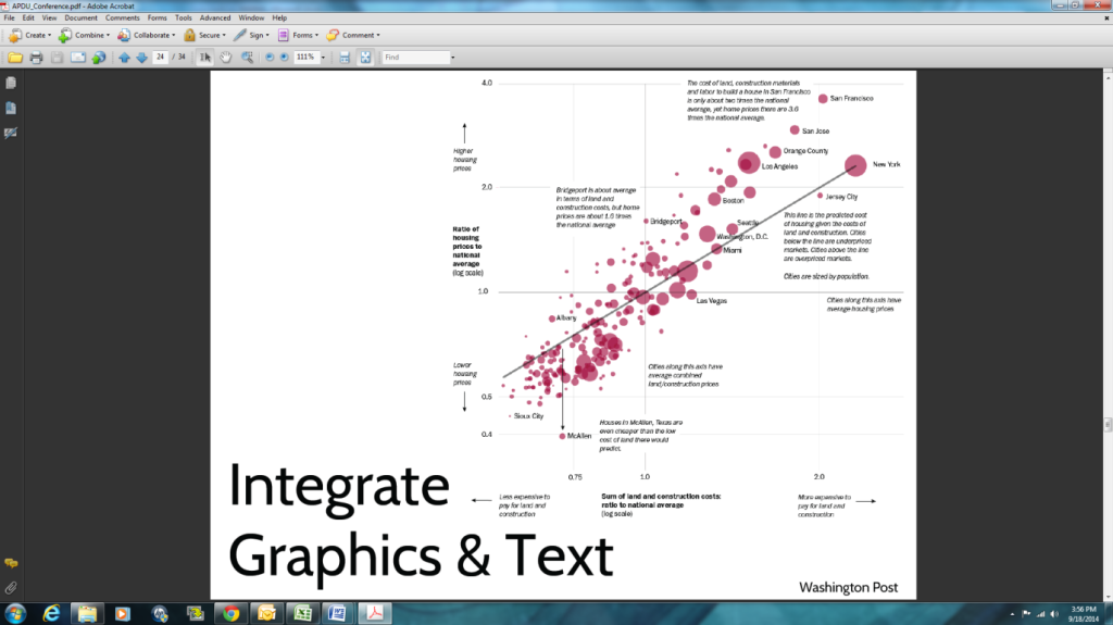
Bradford Hesse, speaker from this session, recommended keeping the user in mind to create useful, user-centered data. His book, Making Data Talk, provides a guide to presenting data effectively to influence public policy and decision making. Basic presentation and data visualization tips were offered by Jonathan Schwabish, a senior researcher with Urban Institute. Mr. Schwabish eloquently articulated that the primary purpose of data visualization is to solicit feedback from users. His recent publication, The Graphic Continuum, is a chart with nearly 90 graphic types to visually express data.
Final breakout speaker Michael Pack, Director of University of Maryland’s Center for Advanced Transportation Technology Laboratory (CATT Lab), presented various tools created by the CATT Lab for user-centric data visualization ideas. Mr. Pack suggested removing “chart junk” for a simplified form of communicating data.
The panel discussed what elements make data visualization successful. Instead of being concerned with the number of hits or likes a pages or graphic receives, a successful graphic or data communication is one that actually affects policy change.